deviant art

Deviant Login Shop  Join deviantART for FREE Take the Tour
[x]
Shop Similar Prints
This Print Not Available
Download Image
JPG, 1000×1391
more ▶

More from ~ChuckBOS

Featured in Groups:

Details

April 4, 2005
1.4 MB
1000×1391
Link
Thumb

Statistics

Comments: 136
Favourites: 590 [who?]

Views: 13,686 (0 today)
Downloads: 4,078 (0 today)
[x]
:iconchuckbos:
Nous tuerons ces enfants de la ville qui nous volent nos rites.

We'll kill those kids from the city who steal our rites.
Add a Comment:
 

Daily Deviation

Given 2005-09-16
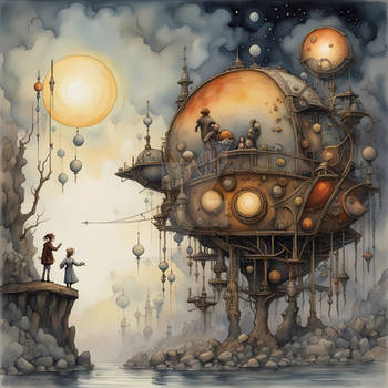
Time for a little something different. CUILLERE DE MARS by ~ChuckBOS offers an interesting skew at, well, whatever you make of it, of course! *snuggles the grizzly* Check it. ( Suggested by !mylittleapple and Featured by `halfliquid )
:iconi-am-god-la-dee-da:
oh my, an awesome and terrifying fantasy world. I love the use of the map outlines at the bottom of the image.
:+fav:
Reply
:iconescapepodone:
~escapepodone Nov 15, 2007   Interface Designer
wow nice, great combination of elements
Reply
:iconsilvekoski:
Excellent landscape! Much fun to look at!
All components belong together!
Reply
:icontoshiros-my-hero:
this is gorgeous. i love it when people create their own kind of visual world; this just seems really natural, like, Of course all those elements should go togther in that way...!
Reply
:iconmrs-spacewoman:
mwaw, j'aime trop l'arrangement, ça crée un petit mood surréaliste.
Plein de lignes fluides mais ça reste tout de même calme. Enfin... c'est pas mal cool.
Reply
:iconkareemrizk:
!kareemrizk Jul 14, 2006   Traditional Artist
This is really nice. It has an underworld character to it while mixing it with an oldworld infleunce; a mysterious world.
At the same time you have included some vector elements. I myself am completely bored of seeing so much of that
vector, rainbow, la-la-land rubbish that has dominated the design industry for far too long. But here you have added
some texture and character to a very flat and commercially overused technique of illustration (vector that is).

It looks like you have cleverly incorportaed an etching of a seashell to create the mountain with buildings on it.
The only criticism I have is about the panda. I feel it detracts from the whole composition, it looks kind of gimmicky
and unecessary. But this is neither right or wrong, it is just another opinion.
Reply
:iconchuckbos:
Well thanks.

And the bear was supposed to look out of place and detached. But I understand how this could be confusing.

And yes vector is boring, I never understood people who praise Illustrator.
Reply
:iconspikedelik:
*spikedelik Mar 21, 2006  Hobbyist General Artist
fantastic!!
Reply
:iconjimmyjumbo:
Woaw!!!!!!!!!!!!!!!!!!!!!!!!!!! i'm gonna watch you
Reply
:iconthevirulent:
I love it. The colors are great...I especially like the pink, brown, and white target looking things. Good job.
Reply
Add a Comment: